SAP Business Objects Design Studio on SAP HANA
Welcome one and all to another reporting on HANA tutorial. In this one, we try to the understand the SAP Business Objects Design Studio. It is the one and only recommended solution whenever the client demands dashboards. Dashboards are used for an aggregated view of data and hence are usually meant for upper management. An example would be a sales dashboard to view data at region/country/state level. These reports are not usually interested in going to individual sales order data.
Note: In Mid-2017, SAP plans to provide a single solution combining the data exploration capabilities of lumira and the dashboarding capabilities of SAP Design Studio. This tool will be called Lumira 2.x which will have 2 components – Lumira Discovery (for data exploration) and Lumira Designer (for dashboards).
SAP Business Objects Design Studio Key Points
Report Complexity: Medium-Complex
Report Users: Upper management/Business Analysts
Report Type: Dashboard
Frequency of use in realtime projects: Medium-High
Effort to develop: Medium-High
Creating our first SAP Business Objects Design Studio report
The skills required in Design studio are mostly drag and drop. But advanced customization may require Javascript and CSS.
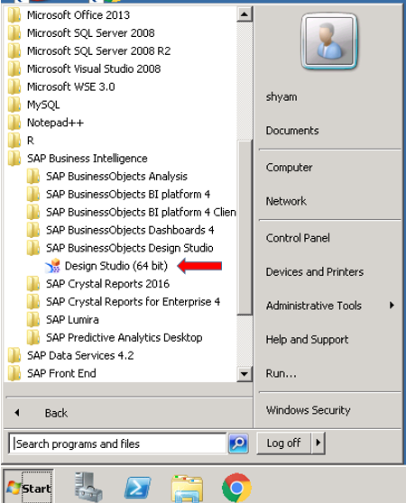
To start design studio, go find it in the start menu under the “SAP Business Objects Design Studio” folder.
The SAP Business Objects Design Studio application starts to load.
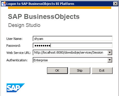
It asks for your login credentials. Punch it in.
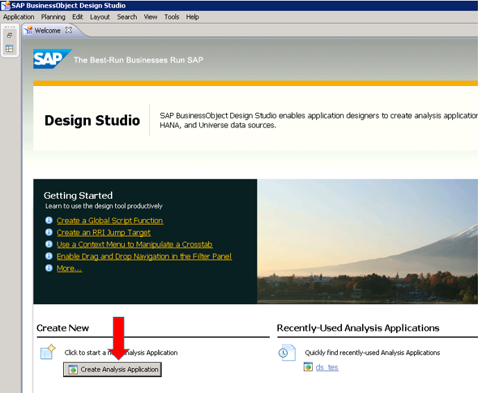
The application starts and the landing screen is as shown below.
Click on the “Create Analysis Application” Link to create a new dashboard.
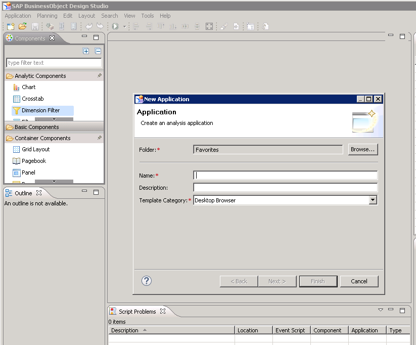
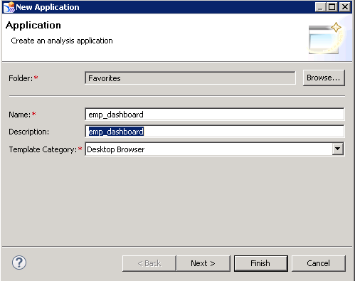
Give your dashboard a meaningful technical name and description in line with your project naming conventions.
I am calling it emp_dashboard since I will be building it on top of the employee calculation view that we created earlier in SAP HANA.
Press Next when done.
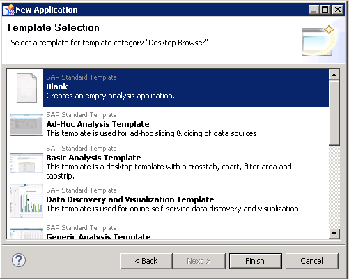
There are plenty of templates available in design studio which can save you some effort in development. You can check them out and use based on your need but for now, I would like to create one from scratch.
Hence, I choose Blank and click Finish.
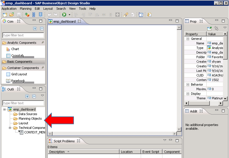
The design screen opens up and the first thing you should do here is tell design studio what the source(s) of your data would be.
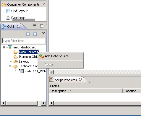
If you see on the bottom left part of the screen, there’s a section with Data Sources folder.
Right click on the Data Sources folder and select “Add Data Source”
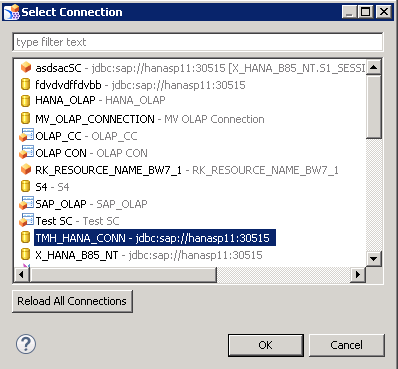
Click on Browse to choose your connection.
Your administrator would usually create these connections and you would just have to check with them for the name and select it from the list. Anyways, if you are interested, we have a tutorial on creating OLAP connections on this website too. Feel free to read that by clicking here.
Select the appropriate connection and press OK.
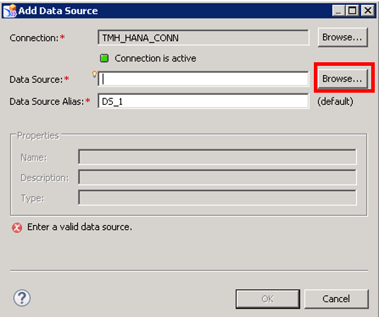
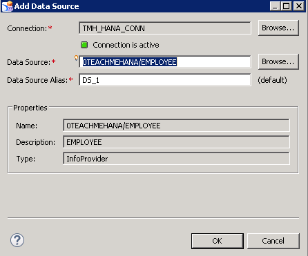
Next step is to choose a data source. This is the HANA view from which we would derive our data for this dashboard.
Click on Browse to find it.
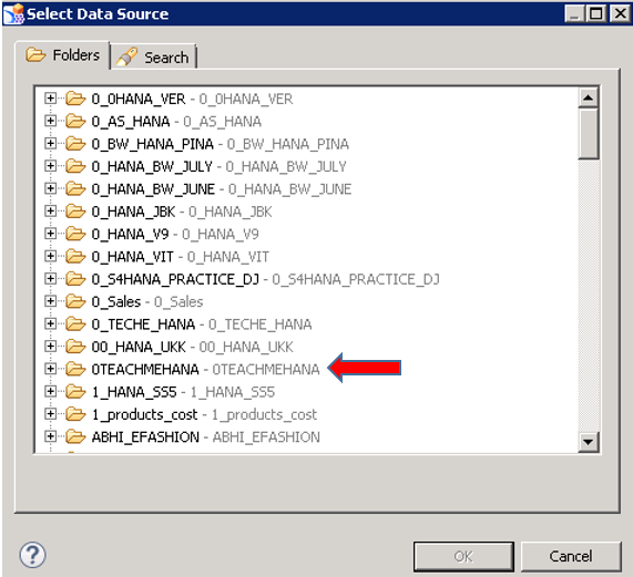
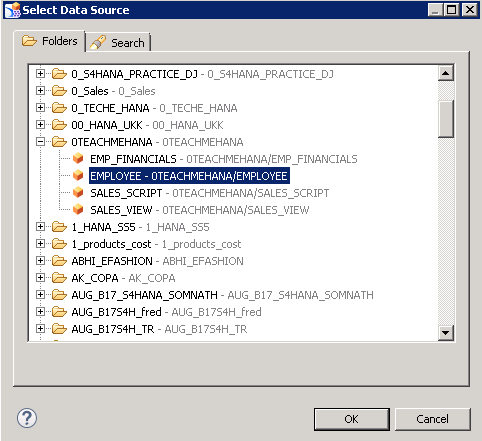
All the packages now appear as folders. Find your package and expand it. Since our employee view is in the 0TEACHMEHANA view, I now expand this.
The EMPLOYEE view is visible now under the package. Click on It to select it and press Ok.
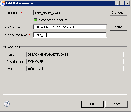
The next step is to give it an Alias. Design studio automatically calls it DS_1 and will call the next one DS_2 and so on.. So it’s better to call it by a better name.
I name it EMP_DS. This is so that it’s easier to reference this alias at later points of development as I will now know that this is the employee data.
Press OK when done.
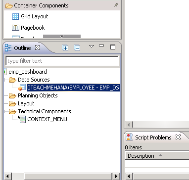
As seen below, the data source has been successfully added.
Next part is to build the report.
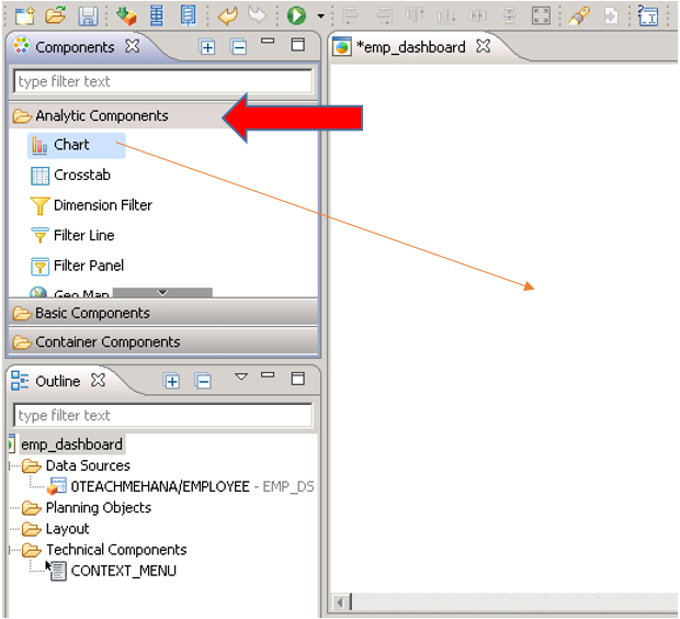
On the top left, you can find a section called Analytic components. This is where you can find all the components you can put in a report like charts, crosstabs, buttons, filters, checkboxes and more.
Let’s pull a chart component into the design pane.
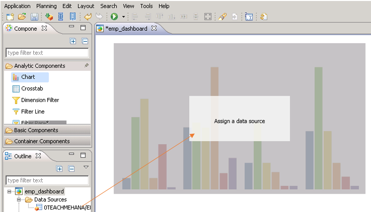
Once the component is in, it asks for a data source to be assigned to it.
Drag and drop the data source we just created into the chart area.
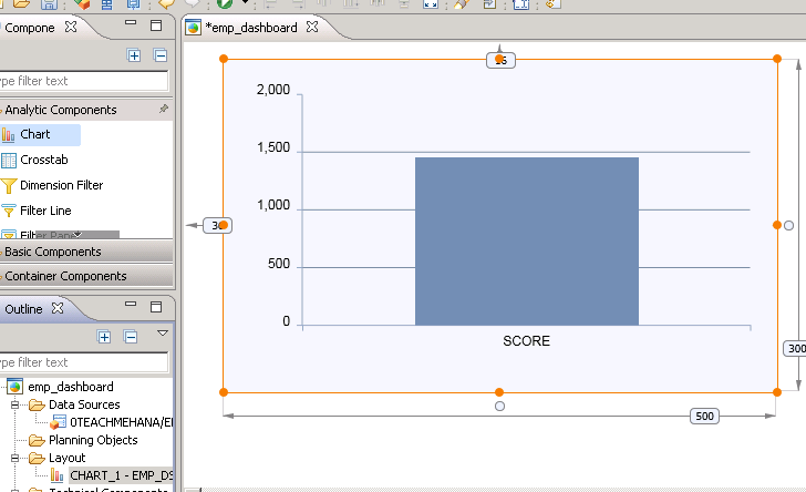
A chart gets created.. but it seems strange. The information doesn’t seem good enough for an analysis . right? Where are the fields except SCORE?
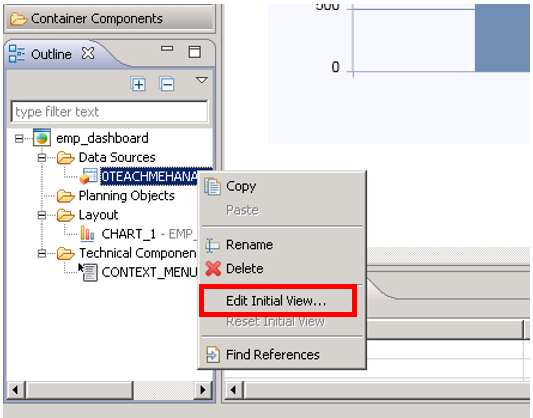
The answer is that whenever a new data source is added, you need to define a structure to it. Otherwise, it remains in its “Initial view”. To fix this problem, right click on your data source and select “Edit Initial View”.
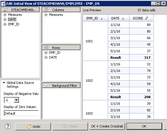
This opens up the initial view structure.
Notice that there is nothing except SCORE in the current definition. You can add Columns, Rows and filters. Right now, the only field in output is SCORE which is there in the columns as we also saw in our initial chart preview.
To fix this, pull DATE and EMP_ID into the rows.
A live preview on the right side confirms that the change indeed works.
Press OK.
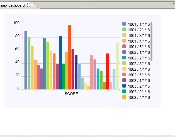
As seen below, with new row fields added, our old chart has become more meaningful.
It is now showing the distribution of score per employee ID per date.
This has become a better chart but it’s still too much going on and the information does not come across clearly. This is a key indicator that the type of chart we have may not be the best choice for this type of report. Each type of chart has its own unique representation. Let’s try a different one.
To learn how to switch chart types and more.. move to the next page.


Fabulous work Shyam.
Thanks Harish. Please share some of this work on social media to support us.
HI Shyam,
Where do we add free characteristics in Webi, or Lumira or Design Studio like we do in Bex ? Also do we have a concept of RKF and CKF’s in these ?
The concept of free chars isn’t the same as BW here. You can have a workaround here. For example, there is a chart which is Revenue on the Y axis and Company code on the X axis. You want the user to be able to also do a revenue (Y) by Country (X) analysis on the same chart. In this case, you can provide 2 radio buttons – Country and Company code, whichever the user chooses would become the X axis of the chart. Of-course, this would have to be a Javascript code for the radio button.
About CKFs and RKFs.. with HANA it’s recommended to do calculations at the view level and use reports for only cosmetic logic. So, there’s not much you can do it terms of calculations in these reporting tools. Especially design studio.. you can only do simple arithmetic logic.. and not complex ones. You would need those fields prepared in HANA and then use your reports only for analysis of these data sets.
This keeps the performance great as the calculations are pushed to the DB layer.